

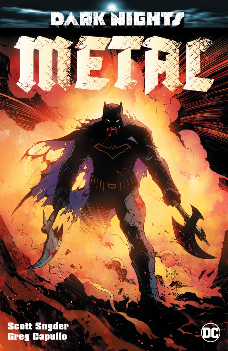
Batman cover by Greg Capullo
It’s been a while since I stopped into my local comic shop and after hearing a few good things about DC Comics’ recent Mister Miracle, I figured I’d swing by and pick it up. Unfortunately for me, my shop was sold out. Not wanting to waste a trip, I picked up a few random issues, one of which was Dark Nights: Metal, the first issue of DC’s latest summer cross-title extravaganza. After giving it a read, I’m still up in the air on whether buying it was the right call or not.
The issue opens 50,000 years in the past with a narrative about three great tribes and quickly transitions to a story in media res of the Justice League locked in a Gladiator-style battle orchestrated by Mongul. Mongul has clad the heroes in accessories that negate their abilities and is forcing them to fight giant robots without any powers. As far as openings go, it was pretty powerful and fairly entertaining, though I don’t understand how it related to the main story at all. Unless it was some kind of continuation from a previous issue somewhere that I missed, all this section did was remind the reader of how clever Batman is.
Dark Nights: Metal was written by Scott Snyder and is the springboard for a new multi-month, multi-title, epic crossover. Snyder is best known for his work on Batman and helped to redefine the character during “New 52” so it comes as no surprise that Batman is the center for Metal. The issue is meant to set the scene for the next few months so most of it is just a run-down of the danger that the Justice League will have to contend with. It’s a universe threatening event and it’s laid out to the audience in no uncertain terms. Literally. Over pages and pages of dialogue. I suppose this is the easiest way for Snyder to really prime readers for what they’re in store for but it doesn’t make for the most explosive of openings. Quite the opposite, actually.
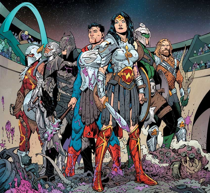
The Justice League are forced to battle in an arena without the use of their abilities.
Greg Capullo’s art did little to capture my attention. I followed him and Snyder for a bit on their initial run on Batman when “New 52” launched and I remember Capullo’s art being far more intriguing than what we’ve gotten in Dark Nights: Metal. I’m not sure if this is due to Jonathan Glapion’s inks detracting from the pencils. Most of Metal is clad in bright lighting, making it a far cry from the darkness and shadows of the “Court of Owls” storyline from Batman. Or it could be the colors by FCO Plascencia, which, again, are far brighter than what I recall of Capullo’s early “New 52” work. It could also be some of the choices Capullo makes; though most of his pages are dynamic and exciting, there are a few panels that are static and uninteresting. Even confusing, on more than one occasion. I’d expect these poor choices from a lesser artist but it’s uncharacteristic from someone like Capullo.
As I stated earlier, most of this first issue is expository, explaining the nature of the “Dark Multiverse” (despite how ridiculous the concept is) so that it’s easy to understand by readers. That exposition helps to bring both regular DC readers and new readers on the same level playing field. However, this causes a confusing disconnect when it comes to casual readers (like myself) and really showcases all of the harm DC has done over the past few years.
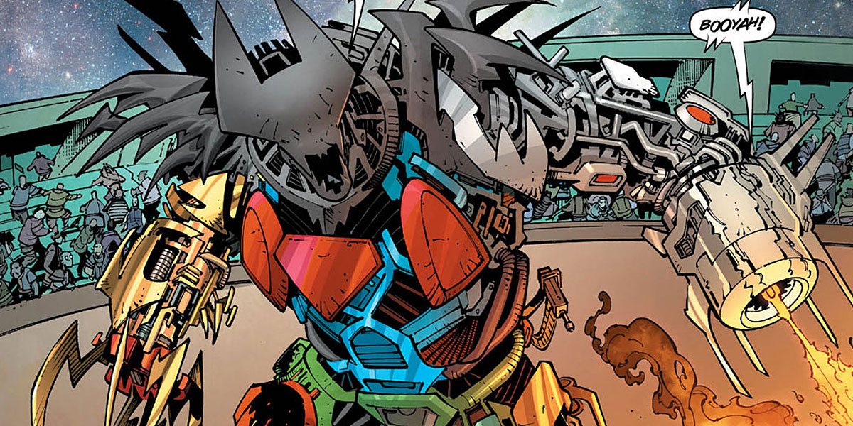
The aforementioned “Justice League Megazord”
Dark Nights: Metal spends pages reintroducing characters that are familiar to casual fans, again, like me, creating an awkward continuity. I found myself wondering why no one recognized Red Tornado or why the name “Carter Hall” isn’t familiar to any of the characters. That’s because all of the dicking around DC did with their universe invalidated these characters, so here Snyder needs to reintroduce them. Am I, as a casual fan who hasn’t regularly read a DC comic since six months into “New 52”, supposed to know that? Evidently, yes, and that’s where my enjoyment of the title started to plummet.
There are a few things that I liked about the issue, a couple of flourishes that brought a smile to my face. Batman riding a dinosaur was a neat little touch and came completely out of nowhere. I also liked Cyborg saying “Booyah,” his catchphrase from the Teen Titans cartoon. I don’t think it would have been possible for me not to hear Khary Payton’s voice in my head as I read that. Besides that, though, I was wholly let down by Dark Nights: Metal. The story didn’t do enough to grab me, the exposition was boring and the concept made me roll my eyes.
As a limited “Elseworlds” type series, I could see Metal being something interesting but as a multi-title crossover spanning six months and set in regular continuity, it just sounds dreadful. I do hope I’m wrong, however, and that the story produces some great lore but after the first issue, I’m not confident that will happen.
Grade: C+

REVIEW | The Batman Who Laughs – #1

REVIEW | Doomsday Clock #4

Review | The Lost Path by Amélie Fléchais

Emerald City Conversation with Jen Wang

REVIEW | Doomsday Clock #2

Top 10 Comics of 2017
Mine! is an upcoming comics collection where the proceeds go to Planned Parenthood. From stories about everyday people to fantastic adventures, Mine! celebrates and defends Planned Parenthood in a book that can live on in our homes, libraries and the halls of Congress.
With states trying to sell women “rape insurance” and inhibiting access to healthcare, something like Mine! is definitely needed to help keep Planned Parenthood funded. There is a Kickstarter campaign going on for the next month to make the project a reality and they have some phenomenal big names and talented indie creators contributing an original story. Pledges range from digital copies to copies for your library to original art. If you have a moment, view their campaign video and the full press release below!
PLANNED PARENTHOOD AND COMICMIX L.L.C. TEAM-UP FOR MINE!,
A COMICS COLLECTION FUNDRAISER
ComicMix Editor-in-Chief Mike Gold today announced the forthcoming publication of a graphic novel of
original short stories to celebrate the important work of Planned Parenthood. The volume, to be edited
by Joe Corallo and Molly Jackson, will be published this fall in celebration of over 100 years of Planned
Parenthood.
Mine! will feature the work of Neil Gaiman (American Gods, Sandman), Gail Simone (Wonder Woman),
Yona Harvey (Black Panther), Gerard Way (My Chemical Romance, Umbrella Academy), Gabby
Rivera (America), Amber Benson (Buffy the Vampire Slayer, The Witches of Echo Park), Mara Wilson
(Where Am I Now?: True Stories of Girlhood and Accidental Fame), Mags Visaggio (Kim & Kim),
Andrew Aydin (March), Frank Conniff (Mystery Science Theater 3000), Yuri Lowenthal (Ben 10),
Brittney Williams (Patsy Walker A.K.A. Hellcat!), John Ostrander (Suicide Squad), and Jill Thompson
(Wonder Woman), among many other top comics creators.
Project Co-Editor Molly Jackson said, “Planned Parenthood is a vital resource for women and men from
all walks of life, providing needed health care and support to millions of people all over the world. We
are proud to do whatever we can to bring attention to their amazing work.”
Co-Editor Joe Corallo said, “The comics community is built on freelance labor that relies on the kind of
access to healthcare that Planned Parenthood provides. We’re thrilled to see such a diverse group of
people in the comics community coming together to support this essential cause.”
A Kickstarter campaign to help finance printing and distribution costs is expected to launch August
15th, 2017. Mine! will be available in bookstores, comic book shops, and electronically all over the
world.
Planned Parenthood is the nation’s leading provider and advocate of high-quality, affordable health
care for women, men, and young people, as well as the nation’s largest provider of sex education. With
more than 600 health centers across the country, Planned Parenthood organizations serve all patients
with care and compassion, with respect and without judgment. Through health centers, programs in
schools and communities, and online resources, Planned Parenthood is a trusted source of reliable
health information that allows people to make informed health decisions. We do all this because we
care passionately about helping people lead healthier lives.
ComicMix, LLC publishes a line of graphic novels by some of the best new and established talent in the
industry. ComicMix Pro Services works with creators to produce, publish and market their work in a
highly competitive marketplace. In addition, ComicMix runs one of the Internet’s most popular comics oriented
pop culture opinion and news sites.
REVIEW | The Batman Who Laughs – #1
REVIEW | Doomsday Clock #4
Review | The Lost Path by Amélie Fléchais
Emerald City Conversation with Jen Wang
REVIEW | Doomsday Clock #2
Top 10 Comics of 2017
 There’s been a lot of talk about boycotting Image Comics over the past two weeks. Those feelings are valid. I feel them too. However, I want to address why this would not work and open up the conversation to alternative courses of action. I’ll discuss what led readers to this decision, how Image makes their money, who a boycott will actually hurt, and ultimately what we can do together to help change happen.
A SERIES OF UNFORTUNATELY SHITTY EVENTS
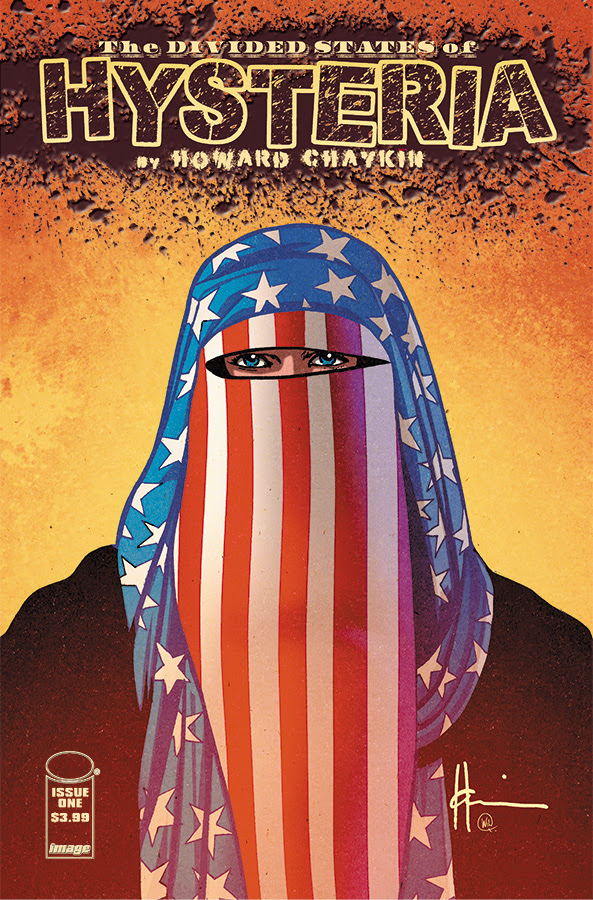
By now, we have all seen the cover to The Divided States of Hysteria #4, the latest title by longtime comic creator, Howard Chaykin. If you haven’t, here is a link to it, but I do warn you: it’s fucked up. From the racial slur to the mutilation, there’s nothing that sits right about this cover. As Comicosity put it:
“There’s nothing thought-provoking about the lynching depicted on the cover of issue #4. Chaykin chose to put a racial slur on the dead man’s name tag. Not spray painted on the wall by him, not written on him in blood. On his name tag. Chaykin decided that the value of the life of the victim he was portraying was so little that he didn’t even deserve an actual name. Just a slur.”
(If you’re pretty up to date on the events surrounding this cover, you can skip down to subsection “THE CALL TO BOYCOTT.”)
This is the latest in a quick series of affronts to marginalized readers regarding this title.
For one thing, The Divided States of Hysteria is a story about “an America shattered by greed and racism, violence and fear, nihilism and tragedy.” While not an intrinsically terrible premise, the writing itself is problematic. Chaykin’s characters use transphobic language in the very first issue while enacting violence against a transgendered sex worker named Chrissie. Transgender individuals already face heightened chances of violence according to a recent study, so why punch down on a group that experiences this as a fact of life?
Secondly, while the title isn’t the first to use this incendiary sort of story telling, having it released during Pride month is tone-deaf at the very least. Image Comics did such a huge promotion for its Pride variants, even releasing one starring Chrissie, that this felt like a slap in the face to the LGBTQIA community. It instead renders the gesture empty, making it a venture capitalizing on struggles we face daily.
Then, when first pressed for comment, Image declined. At this, most people curled their lip and readers were vocal about using their money to support books by other publishers instead. The outrage simmered down after a few days.
Most recently, Image released solicitations, or previews for upcoming issues which feature cover art, for The Divided States of Hysteria #4, as mentioned above. In the aftermath of a slew of rightfully angered comments, tweets, and emails, Image and Chaykin finally issued a statement:
There’s several questions that still need to be answered: Can we do anything as readers? How do these comics get approved when comics are such a collaborative medium, requiring many eyes before the book reaches the shelf? How can we stop supporting a publisher who lets this thing slide?
 LET’S TALK ABOUT IMAGE COMICS

Image Comics was originally created to represent creators who weren’t being appreciated by DC and Marvel for their work back in the early 1990s. In addition to a different business model, namely taking a fixed fee upon publication for the company’s administrative costs in exchange for the creator keeping all creative rights to their property, Image also doesn’t generally interfere creatively. Every comic published by Image lists their entire staff, right there in the masthead. There is no editorial staff, unless the creators themselves hire one, directly out-of-pocket. I spoke to a creator, who chose to remain anonymous, a little more about how this works:
“…to the best of my knowledge, no one looks at the files until the book goes into actual production. Now, this wouldn’t be true for things like covers, which are used for promo and marketing, but content wise there aren’t any checks on stuff that I’m aware.”
For a publisher that prides itself on being diverse, why isn’t more care given to the stories published? It could be because most creators behind current Image titles are predominantly cisgendered white males. It could be because publishers have consistently capitalized on minority experiences instead of celebrating them. Either way, for a supposedly “progressive” leader in independent comics, it’s a handful of specific creators that have made Image seem so forward-thinking. Image is progressive by default, when you compare them to the constant missteps by both DC and Marvel, and consider that a lot of newer readers enter the comic world through the award-winning Saga.
Overall, Image might have this reputation for being alternative and a breath of fresh air in the grand lineup of superhero books, but when you scrutinize the teams behind the books, it really isn’t. It’s hard to forget they’re a company who first and foremost want to make money. This is where readers come in.
THE CALL TO BOYCOTT
While I am certainly not going to tell anyone not to boycott, I do feel it’s my duty as a retailer to lay out why a blanket boycott will hurt brick and mortar shops without impacting the publisher itself. I stress that it’s very different to boycott a creator whose work you don’t care for versus an entire publisher.
Why does a blanket boycott hurt shops and not the publisher? A shop has to pay for comics about three months before they hit shelves. This means the publisher has already been paid, usually before reviews have come out, and before the public at large learns of the book. This is why a Previews catalogue is so important: it highlights upcoming books from all publishers, toys, shirts, merchandise, you name it. You can sign up and preorder anything in that catalogue at your local comic shop. And you should– that way shops can order the correct amounts of new product for their individual shelves.
Otherwise… shops have to take a guess. Some shops employ POS systems that track every bar code that goes out the door, and some do it all by paper and pencil, which works great for titles that have already come out and have an established fanbase. For new titles, we have to essentially wing it and put faith into it without having read it, in the hopes that it will sell. This is a much easier bet to make for bigger publishers like Marvel, DC, and Image than it is for smaller publishers.
Where a large corporation can handle a boycott by laying off people or raising the price of a product to offset the money lost, Image would have to cancel titles. It wouldn’t be titles like The Walking Dead either, it’d be the ones with smaller, dedicated fanbases that may not have high print numbers.
I asked my creator friend about this as well:
“It’s for sure going to hurt shops first and more. As you know, comic shops are buying stuff non returnably. So if, say, the entire customer base of a store decided at once to stop buying Image (or any other publisher) while the shop could adjust for future orders, they’re stuck with the stock they have. And stores, typically, have a lot less margin for that sort of thing than publisher.
In the specific case of Image, the next person up the chain, in terms of being hurt, are the creative teams. Image doesn’t profit off singles, and they only profit a little off of the rest. It’s hypothetically possible enough boycotting could reduce the number of titles they have and hurt them financially like that, or hurt trade enough, but by nature of the comics market and the Image model, you’re always going to be preferentially hurting shops and creators.
A boycott that was actually effective would hurt marginal titles most. Saga can lose 50% of it’s audience and still be profitable. The Few couldn’t.”
So, what can we do?
PATHS OF ACTION
Be vocal about why you’re not purchasing a book in as many places as you feel comfortable. Utilize hashtags, tag the publisher, tweet about what you are purchasing instead! You can launch a movement with peers and use the tools at your disposal to bring attention to the issue at hand, much like people did with Milo Whatshisface’s book under Simon & Schuster. Maybe it’ll be canceled and maybe it won’t be. There’s not a precedent for that exactly, but we can chalk that up to being disorganized about how we have been going about this. There’s also a wider range of representation happening than ever before, and until the creators ARE the people represented, there’s bound to be mistakes here and there. As long as there’s an honest conversation, progress can be made.
It shouldn’t fall on readers, both new and old, to constantly strive for change when it should come from within the industry. The same old white creators with the same old ideas should be encouraged to use their reputation and clout to fill their teams with people of color, women, queer people.
Whatever you do, DO NOT tag and/or attack the creator in your missives. Even if they’re the actual worst, they’re still people at the end of the day.
Focus on individual titles, look up your favorite creators and support their endeavors, either by buying their other work at a convention, commissioning a piece of art, signing up for their patreon, etc. Don’t be afraid to vote with your dollar.
It’s time for the comics industry to stop failing us. Us being retailers, readers, creators. Let’s stop pushing away a new, hungry readership and welcome them by listening. Hire qualified younger people who can point out things that may be easily missed. Get consultants on books if a publisher insists that same old creator writes a character with vastly different life experiences. Hell, just take a lap around a convention’s artist alley and take it in. See what people are buying and are excited about. These are new readers. These are people barely getting into books. These are seasoned fans reaching for something new. Yes, even the women ogling everything Kevin Wada has on sale. Yes, even the dudes purchasing J. Scott Campbell prints. Yes, even the queer people picking up that hard to find Pop figure. Yes, even the children standing in line to get a photo with Stan Lee.
Let’s do this together.
REVIEW | The Batman Who Laughs – #1
REVIEW | Doomsday Clock #4
Review | The Lost Path by Amélie Fléchais
Emerald City Conversation with Jen Wang
REVIEW | Doomsday Clock #2
Top 10 Comics of 2017
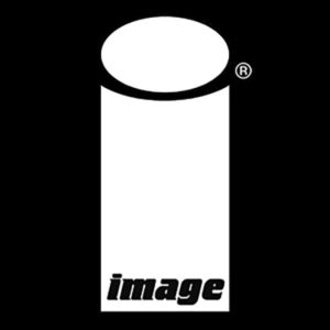
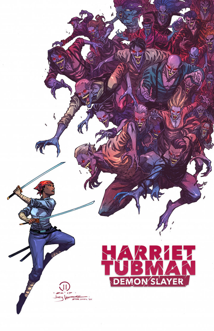
Concept art for Harriet Tubman: Demon Slayer
For a few years back in the early 2010s horror mash up stories were all the rage. Take an innocuous but well known thing and mix it with a fantasy horror trope and a new hit was made. These were most evident through books like Pride and Prejudice and Zombies and Abraham Lincoln: Vampire Hunter and probably a few others not written by Seth Grahame-Smith. Though that genre has been dormant for a few years, it’s come back quite well with the recent release of Harriet Tubman: Demon Slayer.
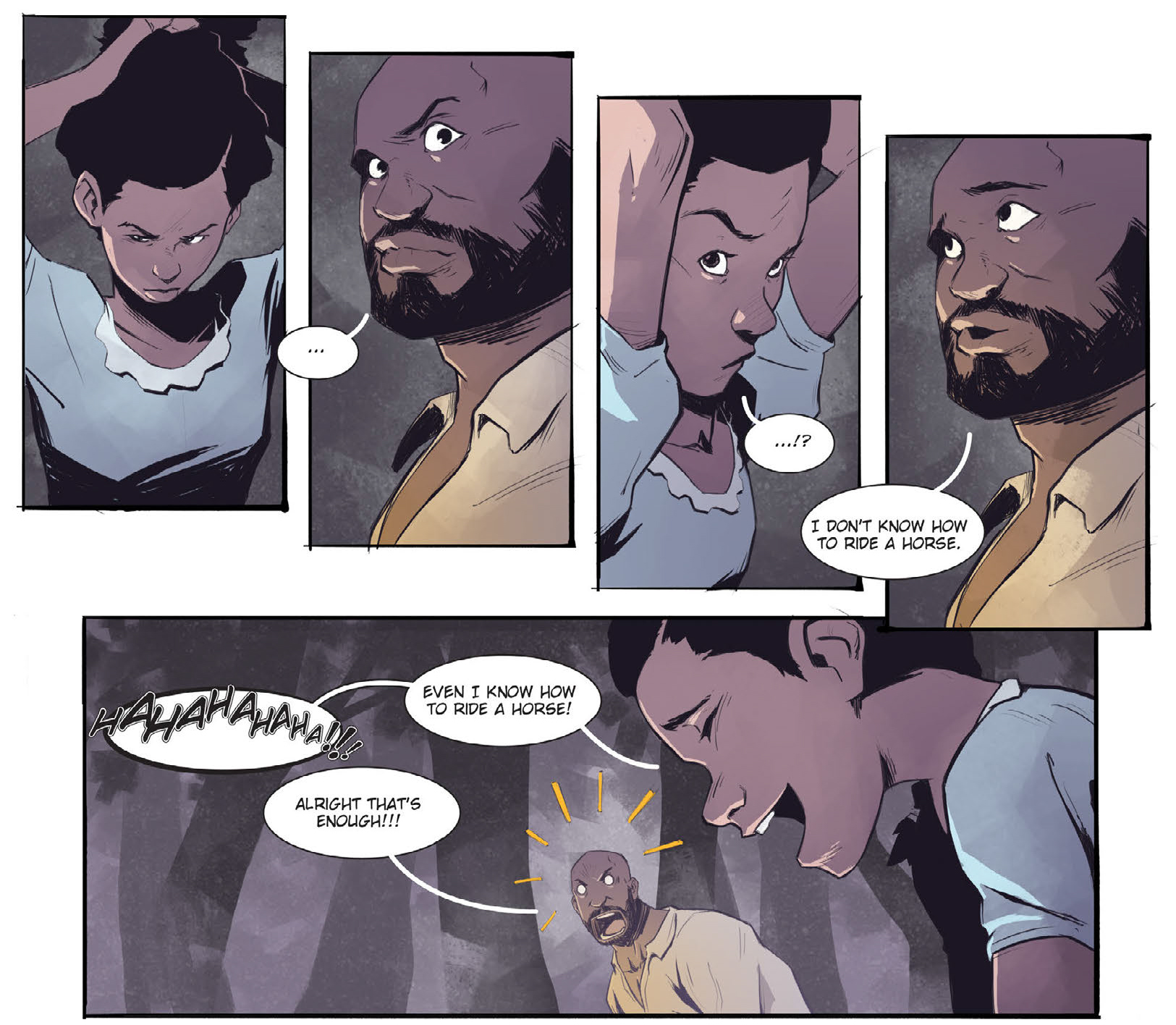
Written by David Crownson, Harriet Tubman: Demon Slayer takes place (appropriately) in 1860, deep in the heart of America’s days of Slavery. It opens with a slave family, the Edgefields, as they escape their plantation in search of a life as free folk. When they run afoul of a trio of shady white men, the Edgefields stand their ground only to discover that these men aren’t exactly what they seem to be. Luckily, a mysterious stranger, the eponymous Harriet Tubman, shows up to save them.
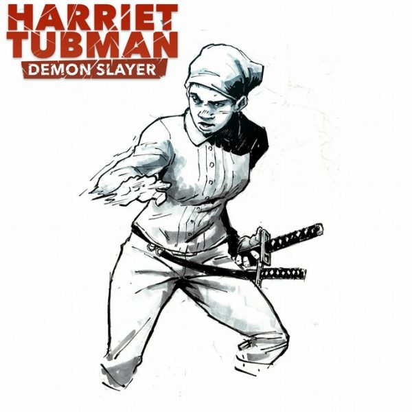
Harriet Tubman: Demon Slayer by David Crownson & Courtland Ellis
One of the things I liked most about the book is the humor. Within the first couple of pages, Crownson makes a joke at the expense of one of his characters and it’s brilliant because it serves a higher purpose than a mere moment of levity. In addition to setting the tone for the book, that initial joke lets the audience know that despite the heady subject matter, they’re allowed to laugh at the story. This is a necessary cue for readers like me, a middle class white man, during the times that the N-word gets bandied around. That word would (rightfully so) make modern audiences uncomfortable but was necessary to tell a story that borrowed heavily from the time of slavery and Harriet Tubman’s real-life struggle. Crownson breaks the ice early to alleviate any possible squeamishness.
Harriet Tubman: Demon Slayer by David Crownson & Courtland Ellis
The art on the book is superb. Courtland Ellis’ art is smooth, his figures realistic and graceful. There are no overly muscular men rippling through torn shirts. His women aren’t bodaciously disproportioned, and in fact have noticeably different body types. Ellis uses subtle facial expressions on his characters to portray emotions and tip the readers off to what they’re thinking, but he’s then able to go all out during the funny moments. It can be a jarring juxtaposition at times but really ramps up the humor.
The art isn’t perfect, though. Most of the pages are beautiful, however, there’s some panel progression that feels off. Some of the character movement is choppy and stilted, which is detrimental in a book that relies heavily on fight scenes. Thankfully, it’s easy to overlook because there are so many other things to enjoy but hopefully it improves as the series progresses.
Ellis also shines in how he draws backgrounds, notably in the way he uses large brushstrokes to signify foliage. It’s drastically different from mainstream comics and I absolutely love it.
My biggest problem with the book is the dialogue. While most of the characters’ speech is smooth and energetic, the story is sprinkled with one-liners that just seem trite and unnecessary. It tended to be more good than bad, though.
Harriet Tubman: Demon Slayer Issue #2 cover
I also wasn’t a fan of the localized dialect. This was probably included to show how different groups speak differently and was effective in establishing the world the story takes place in. I felt like it slowed down the reading experience, forcing me to puzzle out what the characters were saying. I understand that I’m splitting hairs here and maybe sound a little pedantic but this was definitely my take away from the reading experience.
Also, I need to point out the book’s poor punctuation. Normally I don’t even notice the lettering in comic books but the fact that this drew my attention means that it really stood out. Granted, some of the punctuation choices may have been stylistic but there are some instances that are just inconsistent, making the lettering come off as lazy or rushed. Again, I have hope that this will be remedied in future issues.
Despite its flaws, though, one thing that Crownson gets right is the mystery surrounding Harriet Tubman: Demon Slayer. His opening chapter focuses on establishing the characters. He doesn’t dive too far into why the vampires are chasing runaway slaves or even where Harriet comes from. We know nothing of her past, her upbringing, or how she knows how to fight. Crownson reveals just enough to whet my appetite but not too much that I lose interest and don’t return for the second issue.
Having purchased Harriet Tubman: Demon Slayer on a whim during Free Comic Book Day (it was funded through a successful Kickstarter), I have no idea how to get a physical copy of the book. However, you can buy it in digital on Comixology and Peep Game Comix. And I wholly recommend you pick it up. Not only is this book a fun read but it’s also an interesting take on the horror mash-up genre and the life of one of the most prolific American humanitarians.
Grade: B-
Review | The Lost Path by Amélie Fléchais
Emerald City Conversation with Jen Wang

Review | ‘Catalyst Prime: Noble’ #1

Review | ‘Ghostbusters 101 #1’
A Quick Run Down of Free Comic Book Day

Fancast Friday: The Wicked+ The Divine
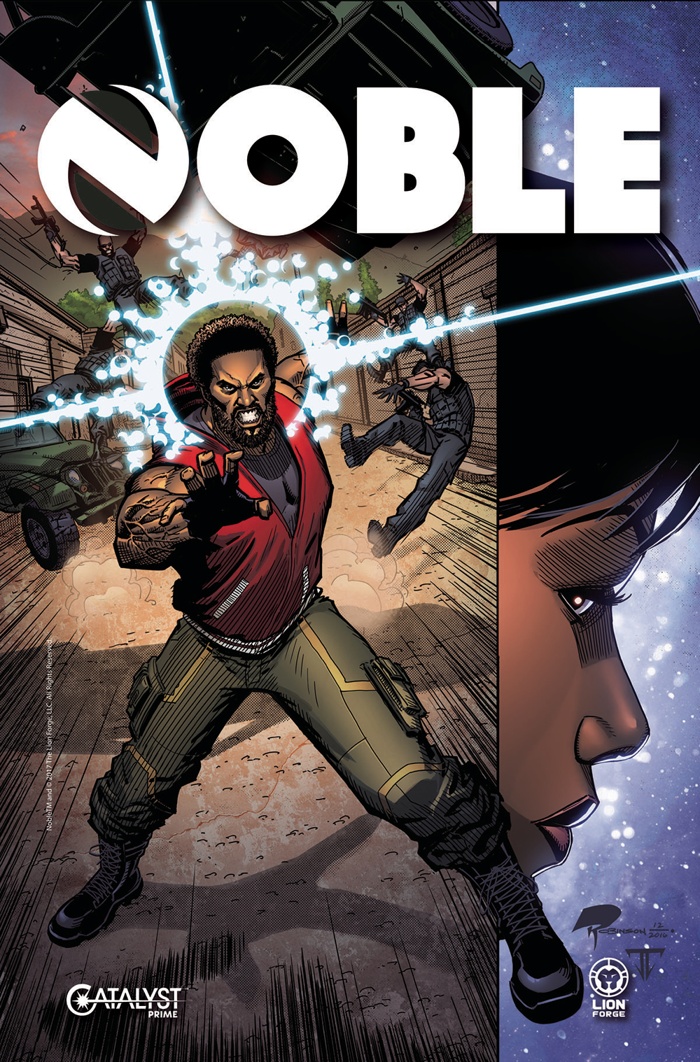
Catalyst Prime: Noble #1 cover by Roger Robinson
As one of the smaller independent presses, Lion Forge Comics is not very well known. Most of their line up consists of comics based on popular 80s franchises (as well as a few not-so-popular). As of recently, though, they are jumping into the super hero game, starting with the release of Catalyst Prime: Noble, a prelude to their upcoming Catalyst Prime universe.
The premise behind Catalyst Prime is that a massive asteroid is heading to Earth and only 5 astronauts are able to stop it. It’s a fairly straight forward premise, one that leaves a lot of room to work with. We’ll learn more about what they’re calling “The Event” on Free Comic Book Day when Lion Forge gives out copies of Catalyst Prime: The Event. From there, the Catalyst Prime universe will slowly unfold in seven monthly comic books. One of these is Catalyst Prime: Noble, which focuses on David Powell, one of the astronauts involved in The Event and what becomes of him in the following year.
The main cast of Noble is only two characters, the aforementioned David and his wife, Astrid. Writer Brandon Thomas was wise to structure the introductory chapter like this as it made it easy to follow. Being new characters, we don’t know much about the kind of people David and Astrid are, so throwing a wide cast at new audiences may become confusing and alienate readers. By paring that down to two, especially two who are so closely tied together, Thomas create a far simpler reading experience while getting the most out of the story.
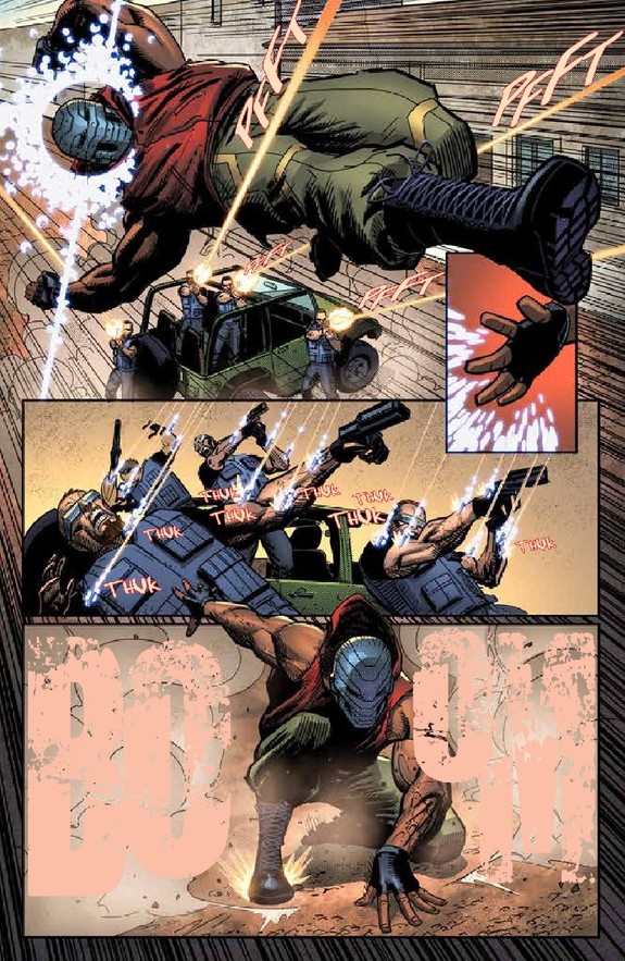
Most of the issue focuses on David, who has no idea who he is but shows some powerful telekinetic abilities, being pursued by a specialized military team. Everything is left ambiguous; we don’t know why David’s on the run, why these men are chasing him, or who the mysterious “she” is that sent them. It’s a well written, well paced scene that’s enhanced by Roger Robinson’s art.
A page from Lion Forge’s ‘Catalyst Prime: Noble’ #1
What I like most about the art is Robinson’s style. He uses a lot of lines, most especially in his figures and when indicating motion. It’s very different from a lot of the more mainstream comics and lends the book a gritty feeling. I use “gritty” as it’s supposed to mean; coarse and dirty, not dark and broody as it’s become to be known. Which I mean as a compliment. The scene involved David being chased by a group of large men through a sandy, desert town. One word that should be used to describe this is “gritty.”
The panel progression is very cinematic. From the very first page we get a slow zoom out from Astrid’s wedding ring as she sits nervously in a waiting room. This transitions to a flashback of not long before, revealing the reason she’s nervous. That lasts less than a page before we return to the present moment, when Astrid is given terrible news and breaks down in tears. Three pages is all it takes to recap her harrowing experience losing her husband in The Event and it’s all that’s needed. Wonderful work by both Thomas and Robinson.
I also loved the end twist. It’s a pretty big reveal that most writers would dangle in front of readers, dropping little clues here and there through subsequent issues in order to keep them on the hook. But Thomas tells us up front at the end of the issue who is masterminding the hunt for David. It’s a great reveal because it opens so many more questions that entice readers to come back without resorting to clichés and cheap tricks.
As a fan of super heroes, it’s nice to break away from the worlds of Marvel and DC, which are steeped in so much history that it’s often difficult to keep up. Catalyst Prime offers a reprieve from that, with strong characters that we get to see evolve and grow in real time. It’s also great to see a comic so deftly blend the techniques of filmmaking into its storytelling. I hadn’t heard much about Catalyst Prime before reading Noble but now I’m definitely looking to go deeper into the universe.
Grade: B
REVIEW | The Batman Who Laughs – #1
REVIEW | Doomsday Clock #4
Review | The Lost Path by Amélie Fléchais
Emerald City Conversation with Jen Wang
REVIEW | Doomsday Clock #2
Top 10 Comics of 2017
I know this review is a little late considering the issue has been in shops for a couple of weeks now but I really need to talk about Ghostbusters 101. Since IDW announced the title, I’ve eagerly awaited its release. It marks a big step for Ghostbusters as merges the original team with the team from the 2016 reboot movie in comic form.
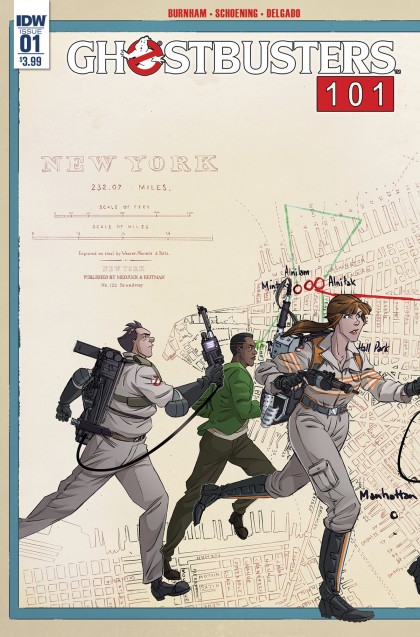
Ghostbusters 101 #1 cover
As the intro to a 6-part limited series, the first issue sets the stage perfectly. There’s not much in the way of action, though the first few pages do pull the reader in quite well. They also serve to introduce new readers to the personalities of the original team of Ghostbusters.
From there we get a glimpse at Walter Peck, the Ghostbusters’s government liaison, and the first seeds of the story arc take root. Basically, the team needs to deviate from their paranormal investigation and elimination and go the route of educators to produce additional revenue. I know it sounds very droll, and for the most part it is. But writer Erik Burnham realizes this and takes the time to poke a little fun at it to help lighten the mood.
Before I get more into Burnham’s writing, let me say that I’m a big fan of Dan Schoening’s art. He takes a lot of inspiration from the actors’ looks from the film but interprets them in his own way. This makes the comic characters feel like separate entities even though the comics relies heavily on the lore of the film. To contrast that, he draws the new team in the spitting image of the actresses, which helps pull the realism of the new movie into the comic. Granted, this is probably due more to likeness rights than character interpretation. I’m sure the producers planned heavily on multiple revenue streams with comics being one part of that.
The art also shines in more than just the characters. Schoening knows how to create movement on the page. His panels are dynamic and exciting, which really goes a long way to telling a great story.
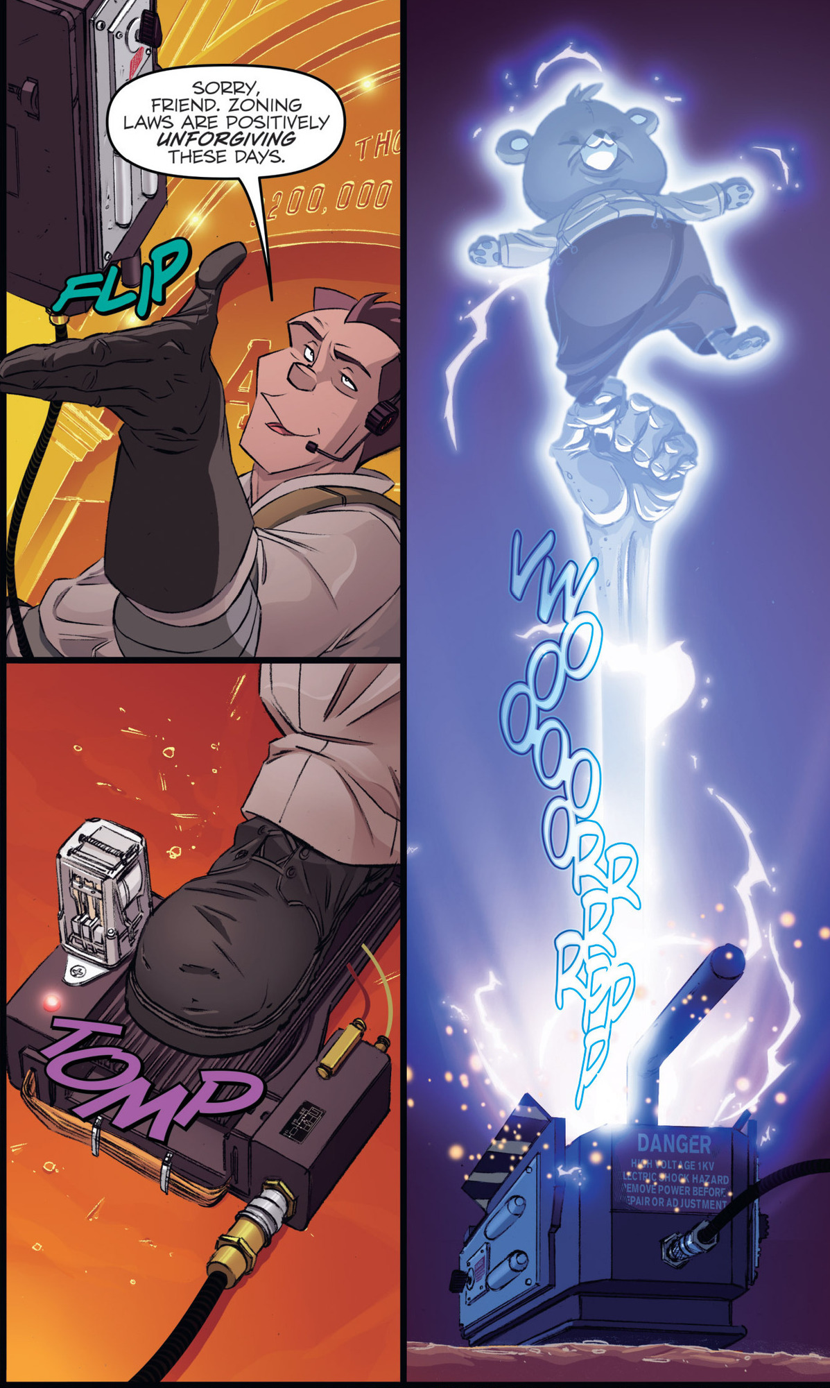
Venkman catches a ghost.
The pencils are enhanced by Luis Antiono Delgado’s vibrant colors. All of the detail and depth he puts into the characters and environments adds life to the book. Also, I love the different effects Delgado uses, such as the glow of the ghosts and the proton streams. They go a long way to making the comic feel cinematic and are beautiful touches.
As the sole writer of Ghostbusters at IDW, Erik Burnham has a strong grasp of the characters. Just like Schoening, he takes influence from the movies but also manages to make them his own. Venkman is still flippant with a dry-wit, Spengler the stoic intellectual. But Burnham takes license and veers the characters into unexpected directions, which is fantastic since it makes the stories less predictable.
But again, just like Schoening, he basically carbon copies the new team into the book. Burnham’s dialogue for Tolan, Holtzmann, Gilbert and Yates is so on point that I could practically hear the actresses’ voices saying the words. This is not a complaint. Since most readers may not be as familiar with the new Ghostbusters, this is a perfect introduction for them into the comic book world. In addition, it’s wonderful to see these great characters brought back to life since we probably won’t be getting a sequel due to less than stellar box office turnout for the film.
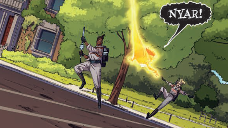
Holtzmann and Tolan in action.
After that glowing praise for both the writing and the art, there is a glaring drawback of this issue that needs to be addressed. It is heavily steeped in backstory. Characters make many references to previous events which could easily lose readers who haven’t kept up with the IDW series. Without a doubt, this shows how tightly knit Burnham keeps his narrative, that he can make callbacks to the team’s earlier adventures. But the addition of the new team is bound to draw new readers. Younger readers whose first introduction to the Ghostbusters is the 2016 movie. If they have trouble following the story because of these callbacks, then they may be unlikely to keep up with the series. I’m not saying Burnham should have omitted the references completely, but an old-style Editorial Notes showing previous issues may have been helpful.
I feel that it’s an important step in the IDW series because it brings the new team of Ghostbusters into the comics-verse. Given the vitriol the reboot received, all from the fervor that was created by the casting of four women in the lead roles, having this team of Ghostbusters interact with the “classic” team goes a long way in showing the nay-sayers that a reboot doesn’t negate its predecessor; in this case, it enhances it. Needless to say, I’m looking forward to the rest of this series.
Grade: A-
REVIEW | The Batman Who Laughs – #1
REVIEW | Doomsday Clock #4
Review | The Lost Path by Amélie Fléchais
Emerald City Conversation with Jen Wang
REVIEW | Doomsday Clock #2


